Categories
open content User experience Web 2.0 Wikis

Why Flickr Commons? (and why Wikimedia Commons is very different)

The Powerhouse is coming up to the 2nd anniversary of our joining the Commons on Flickr. Back when we joined there was only the Library of Congress and we trusted that we were making the correct decision back then. (I’ll be blogging an interview with Paula Bray around the time of the anniversary.)

A lot has changed at Flickr in the intervening time but I’m still confident that the Powerhouse made the right choice. In fact, the impact that joining the Commons on Flickr has had on the organisation has been unexpectedly significant. We’ve even started to move some photographic collections that were acquired as ‘archives’ into ‘objects’ in their own right. And photography is becoming an important marker of what we do at the Powerhouse. We’re delving into photographic competitions much more too and we’ve changed how we approach visitor photography too.

A couple of days ago Mia Ridge, Lead Web Developer at the Science Museum in London blogged a question – “Why do museums prefer Flickr Commons to Wikimedia Commons?”.

This was responded to by Liam Wyatt of Wikimedia Australia who outlined a case for why Wikimedia Commons might, in fact, be a better fit than Flickr – especially now that the Commons on Flickr is currently not taking new requests to join whilst they process the volume of existing applications.

For the Powerhouse the aim of placing some of our “no known Copyright” photography into the Commons on Flickr was to seed these photographs to a large, broader and interested audience who, in return, could add value to the collection by commenting and tagging the photographs.

Later, we’d find that other value would emerge.

The well documented Flickr API allowed for the construction of a good number of mashups and other applications to be built upon the photographs both by others and by us. We published a book, made easily and relatively quickly using the data.

For us the Flickr Commons is currently different from the Wikimedia Commons for a number of reasons –

1. Context matters a lot.

There is a reason why the Commons on Flickr has focussed almost solely on photographic collections, and that is because Flickr is a site that has been and continues to be designed for people interested in photographic images. As the Library of Congress stated in their initial rationale for joining Flickr, it was to “share photographs from the Library’s collections with people who enjoy images”. And where is the largest community of people with such an interest on the web? Flickr.

2. User experience and community

Because of this known user base Flickr has a well developed user interface and user experience which purposefully creates and helps encourage certain social norms and acceptable behaviours. The requirements of verified user accounts and personal information all work to reduce the negative effects of anonymity – critical in building a positive sense of community, even if they exclude some users as a result.

3. Managing that community

Flickr has a well developed set of community management tools and community managers who are employed specifically to ensure the community ‘plays nice’ and there is a hierarchy of escalation should it become necessary. The cost of US$25 per year is incredibly cheap for this.

4. A sense of content control

Uploaded images as well as any user generated content such as tags or comments can be removed at any time.

5. Statistics

Flickr has good enough tracking and measurement tools which are useful for checking where users are coming from, what they are looking at, and what they do. Ideally the statistics that we could draw from Flickr would be more useful and able to be downloaded in raw form and segmented – but even in the rudimentary state it is possible to see ascertain why there are sudden spikes of traffic to particular images, or when an image gets lots of comments.

The Wikimedia Commons is, currently, a pool of images which can be used for many purposes. However without visibly active community around the images they exist without a clear ‘intended purpose’. In fact they only encourage viewing or takeaway (download). For some people this is liberating – a resource without obvious legal or social constraints. But much in the same way a museum is neither a library or a “shed full of stuff”, the ability to have known manageable social constraints is in fact quite valuable.

I am pleased that Liam mentions the Wikipedia Usability Iniative and once this is completed the Powerhouse and others will no doubt explore the opportunities.

Even without direct participation in the Wikimedia Commons the Powerhouse has been interested to see that many of the images have been copied into the Wikimedia Commons. And then used to illustrate various articles in Wikipedia. This has been a fortuitous outcome but it was never a primary aim of the Commons on Flickr project – nor would it be one today. Other Commons institutions have not been as positive about this migration of content to Wikimedia.

For us, the overall community effect of Flickr and the deep engagement by a small but passionate group of Flickr users, has been the most positive result for us.

Whilst Wikipedia and Wikimedia are, in themselves, exciting projects, their structure, design and combative social norms do not currently make them the friendly or the protected space that museums tend to be comfortable operating in.

Whilst Liam (especially! 1 & 2) and many others are working hard to make Wikipedia and Wikimedia a better place for museums and their content, these are very difficult structural issues to resolve.

It is worth remembering that when the Commons on Flickr started it was the brainchild and passion of George Oates. She was able to ‘make it happen’. Now Liam Wyatt might be in a similar position – if Wikimedia were ‘less democratic’ (some might say dysfunctionally democratic). Except the structure of Wikipedia/Wikimedia makes that nigh impossible.

Nevertheless I’m excited about the strategic workshop in Denver looking at how museums might work with Wikimedia that will surface many of these issues. They are complex and many.

Categories
User behaviour User experience Web metrics Young people & museums

“Let’s make more crowns”, or, the danger of not looking closely at your web metrics

Happy new year everyone.

I’ve got a bit of a backlog of posts but there is an ulterior motive for getting this out the door – and, well, it has been more than 18 months since I should have written about this.

Make-a-king's-crown---Play-at-Powerhouse screenshot

Over on our children’s website – Play at Powerhouse – we have a lot of content for children and parents to do at home either before or after they visit the Museum.

The website was launched in April 2007 as a way of segmenting off the ‘family’ audience from our main website and improving the user experience for that important group. Prior to its establishment, parents who just wanted to know what was on for their kids would have to navigate through exhibitions and events to figure out what was appropriate.

When the site was designed the main navigation was split into two halves – two very simple sections covering the practicalities of a museum visit, and two section for online and at home play.

And so in setting targets for the site we kept in mind that ideally we’d have a pool of casual visitors who we’d best serve by providing quick information that better helped them plan their visit to the museum; and a second group who we’d hope to build as ‘regular’ users of the site for craft activities, and to a far lesser extent, a few online games.

(Digressing briefly, we decided not to focus much on making ‘interactive games’ because there were already many established websites – in Australia the work of the national broadcaster the ABC especially – doing that as their main online focus and, frankly, far better than we could ever expect to do both in terms of design and also promotion).

The ‘craft’ section – Make & Do – was seen as a valuable resource that aligned with the Powerhouse’s reputation as a museum of ‘making things’ in a very crowded children’s web space. Importantly, too, we felt that it was good to support parents in giving them activities from the web that purposely meant doing things with paper and scissors, or out in the garden, anywhere away from a screen.

Over the past nearly three years the site has grown (and is on the schedule for a major UI overhaul!). It attracts a significant amount of traffic – peaking around school holidays as would be expected – and the craft activities, especially, are well linked by sites all over the world.

Internally the site has become integrated with the children’s programming as a whole to such an extent that the site’s Online Producer, Kate Lamerton, is moving over to join the unit responsible for general museum children’s programming. (In many ways this decentralising of content production is a sign of the maturity of the online product).

But that’s not the whole story.

As the site has developed we’ve tried to make user-led choices in the development of new content in the craft area. If the web is good at one thing it is data gathering. Very early on it the thinking of the site we felt that it was important to monitor what was popular and then use that as a means of thinking about what other content should be developed for the site.

Just to give you an idea of the resource burden of content generation – a single craft activity might take two to three full time weeks for Kate to conceptualise, prototype, and then create and instruction set for, photograph and upload. Some take considerably more, others, less.

So obviously we’d want to be choosing those craft activities wisely.

Now not every exhibition at the Powerhouse has obvious choices for craft activities for children, so Kate spends a fair bit of time thinking about ‘events’ to tie activities in with – obvious things like Mother’s Day, Father’s Day [1, 2].

And, because we care about web metrics, we are looking at what is popular and thinking about what I called ‘riffing’ on those – generally making ‘complementary’ thematic content.

But web metrics is a little more complex than that as I’ve said many times here (and in my workshops).

Here’s some data from the last two years.

Let’s first take a look at popular sections by page views for all visitors:

Content type % page views
Make & do (craft) 34.63%
What’s on (events & exhibitions) 24.16%
Play & interact (online games) 15.02%
Visiting (basic visiting information) 6.85%
Home page 15.85%

The first impression here is that the site is doing very much as planned.

The craft activities are generating the bulk of content views whilst the what’s on shows that site visitors are also more likely to be predisposed to visiting the physical museum. As expected with search driving most traffic on the web, the home page is less important as a single entity than each of the larger categories.

Let’s drilldown into Make & Do and see what is popular in there – the top ten by page views for all visitors.

Content type % page views
Craft index 24.63%
King’s crown 15.95%
Outback farm 6.02%
Easter index 3.72%
Knight helmet 3.34%
Princess hat 3.12%
Queen’s crown 3.07%
Masks for the ball 2.53%
Wizard’s hat 2.30%
Witch’s hat 2.14%

Here’s where things get interesting and where the initial thinking became skewed.

The clear leader – by far the most popular bit of craft – is the instructions and templates for making a King’s Crown. And appropriately we went along and made a fair amount of other types of ‘headwear’ – all of which have been popular too.

But are we serving our core audience? Who are these people who are coming to download the instructions for making a King’s Crown?

Let’s re-do those data tables again but this time let’s only look at traffic from Australia and then Sydney.

Content type % page views (all) % page views (Australia) % page views (Sydney)
Make & do (craft) 34.63% 21.06% 15.86%
What’s on (events & exhibitions) 24.16% 30.83% 33.85%
Play & interact (online games) 15.02% 16.12% 16.20%
Visiting (basic visiting information) 6.85% 8.64% 9.38%
Home page 15.85% 19.46% 20.58%

A different story starts to emerge.

Those craft activities are viewed by a far smaller proportion of site visitors the closer we get to our Sydney-based visitors. In fact, for Sydney-based visitors craft activities are even less popular than the online games on a percentage of total page views basis. Not surprisingly, though, by being located in Sydney and thus able to physically visit the Museum, the What’s On section increases in popularity.

Here’s those top ten craft activities again.

Content type % page views (all) % page views (Australia) % page views (Sydney)
Craft index 24.63% 35.29% 41.49%
King’s crown 15.95% 3.31% 1.90%
Outback farm 6.02% 3.97% 4.48%
Easter index 3.72% 7.01% 4.47%
Knight helmet 3.34% n/a n/a
Princess hat 3.12% n/a n/a
Queen’s crown 3.07% n/a n/a
Masks for the ball 2.53% 2.68% 1.96%
Wizard’s hat 2.30% n/a n/a
Witch’s hat 2.14% n/a n/a
Science index n/a 2.83% 3.16%
Easter baskets n/a 2.58% n/a
Speace helmet n/a 2.49% n/a
Mascot colouring in n/a 2.18% 2.68%
Healthy living n/a 2.02% 2.56%
Space index n/a n/a 2.19%

Now this is where it gets really interesting and where the team realised the importance of geographic segmentation. That headwear – the crowns and helmets and hats – wasn’t popular amongst local audiences. In fact, the more local we go the less popular it gets!

So much for putting resources into designing and making instructions for them!

Where was all this traffic for the King’s Crown coming from then?

Here’s the answer.

Country % visits
USA 53.96%
UK 14.27%
Australia 9.14%
Canada 5.42%
Mexico 1.34%

I’m glad our King’s Crown has been popular with Americans – in fact, predominantly Californians and Texans – but without the geographic segmentation being picked up early on in the life of the website we could have continued down that path oblivious to the irrelevance of that content to our local audiences (and the taxpayers who fund the museum).

Have you checked your popular content recently?
Is it really reaching the site visitors you are intending it to?

(Incidentally, if you are intending to attend Museums & the Web 2010 in Denver and wish to do my Web Metrics workshop then book quickly as it is almost full!)

Categories
User experience Web metrics

The 2 in 100 who might matter most – your core web audience

As some of you know I’ve been doing a series of deep dive web metrics workshops for various institutions around the world in the last couple of months and one thing I’ve been interested in is estimating the size of a ‘core museum website audience’.

Whilst we all like the big figures of casual visitors we get to our websites many institutions, having flirted with social media, we are beginning to realise that casual visitors, much like casual visitors through the door of a museum, aren’t so useful for building sustained co-creative relationships with.

This ‘core museum website audience’ is the one that is engaged enough with your online activities that they return frequently. The patterns and trends in how they behave in your website is likely to differ significantly from casual visitors, and these trends should be closely analysed for insights into which are your ‘stickiest’ and most ‘interesting’ content areas.

Obviously, in looking at ‘repeat visitation’, though, it is critical to exclude all internal traffic. (I’m always shocked at how many institutions neglect, often through oversight, to stop their web analytics tools from reporting internal traffic!)

If we are serious about ‘engagement’ then our websites need to be actively growing repeat visitation as a proportion of the total.

So, how are we at the Powerhouse doing?

Looking at the Powerhouse Museum traffic for the last 4 quarters (Q4 2008 to Q3 2009) I’ve seen a sizeable number of repeat visitors to our website. Like most websites the vast majority of our traffic is new visitors (80.41%), but I’m pleased to find some interesting figures in our repeat visitors – the other ~20%.

Over the last 8 quarters repeat online visitation noticeably different patterns emerge around our in-gallery exhibitions and around our online-only content.

The ‘2 or more visits in a quarter‘ segment fluctuates most with the blockbuster exhibitions (Diana and Star Wars) showing the impact of return visitors booking online tickets and checking public event information. Here we see a rise from 13.63% in Q4 2007 to a high of 21.45% in Q1 2009 (Star Wars) before dropping again to 18.54%.

The ‘5 or more visits in a quarter‘ segment has grown steadily from 2.11% in Q4 2007 to a high of 5.22% in Q2 2009 and now rests at 4.78% in Q3 2009. This segment contains semi-regular blog visitors and those engaging with our collection online for research and study, as well as some of our high school curriculum focussed content.

The ‘10 or more visits in a quarter‘ segment has grown consistently, unaffected by the seasonal blockbusters, from 0.79% in Q4 2007 to 2.10% of traffic in Q3 2009. This traffic is our most highly engaged – again predominantly around our most consistent blogs (Fresh & New, Photo of the Day, Object of the Week), certain areas of our collection, and very specific curriculum content.

This 2.10% is one that needs a lot more analysis as does the ‘5 or more’ category. How do they arrive at our site? What are they looking for? What do they spend most time looking at?

Just for the record, as I’m using Google Analytics this data excludes RSS subscription-based traffic (critical for blogs), and does contain a low level of error – those who actively clear cookies (who may not be well represented in a core museum audience – but would be on, say, Slashdot). Of course, this data is far more reliable that log-based analytics.

I’m digging much deeper into this for an upcoming paper at Museums and the Web 2010 in Denver and of course my metrics workshop there too.

I’d welcome others’ opinions on this sort of audience segmentation.

Categories
Conceptual User experience

Five rules for museum content (via Amsterdam)

I’m just back from presenting at the New Museum Lab event in Amsterdam run by the Nationaal Historisch Museum. My talk was titled ‘Digital Effects: Content, Communities and the Museum DNA’ and whilst I won’t be publishing the slides, one thing that seemed to be of interest to a lot of people was this simple list of ‘five rules’. So here it is reproduced.

Museum content, not limited to objects, should be:

1. Discoverable – it is where I am and where I look for it. This means putting content where visitors expect to find it which online means good SEO, folksonomies and smart keywords, and onsite in the galleries it means great exhibition design.

2. Meaningful – I can understand it. Plain English contextual notes and label text, scaffolded where needed and definitely with an appropriate cascade.

3. Responsive – to my interests, moods, location. Content should ideally be able to be personalised with tailored recommendations. Mood responsive? Take a look at the Brooklyn’s handheld project.

4. Useable/Shareable – I can pass it on and share. All content should be released under a license that allows at least non-commercial sharing. Museums are entirely in the social objects business – let’s actually encourage sociality.

5. Available in all three locations – online, onsite and offsite. That means on the the museum’s website, on other websites, in the galleries if it is popular, and if it has a relationship to the outside world it should also be discoverable there as well. The later relies on geo-locations marked in the world either physically or virtually.

Nothing too remarkable here for regular readers or people in the field but sometimes lists are useful. You’ve probably noticed that each of these rules revolve around the notion of visitor-centrism.

Categories
Developer tools User experience

Multi-lingual machine translation from the footer

There’s been a fair bit of chatter about machine translation of late and so when we noticed that the Museum of London team had rolled out the new Google Translate widget on their website we figured we’d give it a try and follow suit.

So lo and behold, now on the Powerhouse Museum main site you can skip to our persistent footer and be presented with a machine translated version of whatever page you are on – menus, titles and all in any of 39 languages from Afrikaans to Yiddish. It is all rather neat and even with the imperfections of the translation the speed and ease of implementation is hard to resist.

English version –

(Traditional) Chinese version –

Categories
Collection databases User experience

Will schools use collection content? The Learning Federation Pilot Report

Over the last 12 months the Powerhouse, along with the National Museum of Australia and Museum Victoria, has been involved in supplying collection data to joint pilot project between the Le@rning Federation (TLF) and the Council of Australasian Museum Directors (CAMD) from March 2008 to May 2009

Museums have always had difficulty preparing material to service education audiences and there hasn’t been a great deal of specific work done looking at how schools actually end up using museum materials. Nor has there been an emphasis on developing ways of speeding up the process of delivering collection records to schools in usable formats and (re)written appropriate for classroom integration. Instead, museums have tended to focus on developing separate areas of their websites holding bespoke content made for schools and aligned with State and National curricula – in many ways mirroring the, often divisive, split in museums between curatorial and research areas and ‘education’ areas.

This pilot project looked at changing this. First it trialled programmatic ways of integrating existing collection content into the everyday teaching in school environments and then evaluated the relevance and use of museum collection records in these scenarios.

Each institution selected a bundle of collection records (643 in total – 2300 were initially envisioned) for the trial and then supplied them using the ANZ-LOM schema. These records were quality checked by Learning Federation specialists and then integrated into their Scootle platform where they could be mixed with other learning assets, tagged, shared, remixed and brought into lesson plans.

Schools, teachers and students discovered the objects with an ‘educational value statement’ through the Scootle portal and then could visit the museums’ own records directly (via persistent URLs) for further drilldown. This added a useful layer of contextualisation, discoverability, and syllabus mapping rarely found on the museums’ own websites (and never in collection databases).

Focus groups were then held with schools who were using the materials to look at exactly how museum objects were being used, and more importantly how teachers and students evaluated their usefulness.

The obvious hurdles of Copyright, content suitability, writing style at the museum end, and the teacher training at the schools end were far greater than any of the technical data supply issues.

Tellingly –

Of the 643 digital resources provided to schools as part of the new model of collaboration between TLF and the three museums, 55 digital resources were selected by schools to include in collaborative learning activities. Of this number, six resources were used more than once. (pg40)

. . .

Even though only a limited number of digital resources were available for the Trial, teachers were generally positive about the quality of these materials. While 73 per cent of teachers believed that the museum content was comparable in quality to other TLF resources, 100 per cent believed that it provided important background information and was well described for their purposes. (pg 41)

The report is available as a PDF from the Learning Federation directly (2mb).

Whilst the report is huge, it is important reading for everyone involved in trying to ensure museum content is written and delivered appropriately for the education sector.

Categories
Interviews User experience

Fictitional narratives & visitor-made labels – The Odditoreum

At the Powerhouse we’ve just launched something called The Odditoreum. An incredibly low-tech “exhibition” with no technology-based interactive experiences and minimal web presence, The Odditoreum feels remarkable for the level of participation it is engendering. Visitors are actively writing their own labels for the objects and even before launch there was a lot of interest when Paula and Erika blogged about seeing some of them in the workshop.

I spoke to Helen Whitty, Public Programs Producer, about the project.

F&N: What is The Odditoreum?

HW: The Odditoreum is a moveable feast whose essential ingredients are a selection of collection objects and a well known author – Shaun Tan. Combined they have made a small exhibition, book, limited edition print and the core of the July school holiday program.

The Museum allocates significant resources to our quarterly school holiday programs and on the whole I think we do great holiday programs and we work hard to maintain the standard regardless of whether that particular holidays are minor or medium size.

The motivation for the theme of the July period came about because the Museum did not have a new temporary exhibition to promote. Nor had we changed much of our permanent exhibitions for children for many years. The specialist facilities of Zoe’s House and The Magic Garden are an exception and had both already been covered in prior holidays.

The Odditoreum’s small exhibition component is 18 ‘odd’ objects that are not currently in storage. Shaun Tan, a celebrated author was invited to write ten of the labels (in fact that’s all he said he had time to write – then wrote eleven). Seven labels were written by young children (from Stanmore Public School) to inspire other visitors to write their own ‘labels’ during the holidays.

The brief for Shaun was to write about 100 words for each object and he could write whatever he liked about each one. I sent him a package with about 20 objects to choose from, each with a photo and extracts from their official documentation file.

He selected those with the most potential to respond to his touch.

F&N: Tell us a little bit about Shaun Tan. Where did you come across Shaun’s work before?

I love children’s books and could barely resist purchasing stacks for my own children. For years I’d been angling to incorporate children’s authors into my programming.

Shaun Tan’s work is a particular family favourite and I thought the imagery in The Lost Thing could have had the Powerhouse in mind. His stories are often simple, elegant and profound – with extraordinary illustrations. I had contacted Shaun a couple of times to work on projects but whilst interested, he was always too busy.

He told me he was attracted by the name (Odditoreum) and ’10×100 word’ labels felt achievable within his busy schedule. The possible material he was sent to work with intrigued him.

Shaun’s writing style can be quite dark as a way of being thought provoking. He told me that happy, or at least fully resolved endings don’t stay with the reader, don’t prompt them to look for alternate scenarios. I like that.

As for the reader – he doesn’t see himself as an author for children necessarily. He describes his audience as:

‘…anyone who is curious, who enjoys strangeness, mystery and oddity, who likes asking questions and using their imagination…[I always ask myself] what are the ways that something can be represented to most effectively invite us to think and ask questions about the world we live in.’

I think he describes the spirit of what we try to do with our work with visitors.

F&N: How were the objects chosen?

At the end of the day the final selection was going to be determined by –

– the available showcases (my initial planning submission referred to ‘within existing infrastructure’ — I love that expression, basically saying ‘its gunna be cheap’ in business plan speak).
– the location and whether it was easily moved (there goes the front window of the passenger jet)
– conservation and display requirements (did I mention cheap?)
– was it intended to be lent out or used in a planned exhibition (unlikely)
– part of a tour for our offsite open storage (yes, the prawn on a bicycle is part of the schools technology offer – sigh)
– sensitivity of donors and/or curators

And ultimately Shaun’s selection.

There were certainly a few of my favourite things in the array.

I don’t claim to know the collection but I have prowled the basement on many occasions for books I’ve authored for the Museum. And not being a curator I wasn’t tied to any particular area (though I do find myself strangely attracted to Z4). I used OPAC. I even circulated an email titled ’31 odd heads are better than one’ to our curators, and sent begging emails to registrars. Many responded.

Suggestions came from carpark conversations, voice messages (“have you seen what’s sitting outside the Transit Room lately?”) and so on. I didn’t actually look in the stores this time, as to be honest I was fitting all this in between too many jobs — but in the end this chaotic series of conversations threw up a lot of interesting stuff.

I gathered up a little selection team (Rebecca, my champion from Exhibition Coordination, Judith, a Casual Assistant and mother of young children (nothing casual about her), Alison (an expert Registrar), Malcolm (our ‘silk purse out of sows ear’ exhibition designer) and we sorted through the piles of images, object numbers and descriptions.

In my head I was looking for things that had some familiarity to a child but looked a bit strange or were made of strange materials. I felt I wanted the selection to come from different collection areas (rather than, say, all clothing) and also from different time periods — so things weren’t odd just because they were old.

I also felt the backstory should be interesting (“oh that’s what it is!”).

The most obvious thing we should have done was to invite children to make the selection. I thought about it but time was slipping away and in retrospect I let go of this idea too easily.

What we all found hilarious was what people thought was odd, and not.

Someone had suggested the barbed wire display which I found a bit odd, but at which a curator commented …’what’s strange about that? Its not even the best collection of barbed wire in Australia’ and I imagined the label could simply read “The second best collection of…”. We didn’t present the barbed wire to Shaun as the Conservators all shuddered, though I think he would have loved it.

And I paused to think about oddness being about lack of familiarity – who know, rural kids may have found the barbed wire too ordinary for words!

In the end things were dropped as they wouldn’t fit or they just got left behind. I miss Lucky Starr’s star shaped guitar as I would have liked a musical instrument

Maybe there’s a bit of ‘curator’ in us all.

And even then some peculiar things arose after the final choice was made.

Sue Gatenby writes “A slide collection of unusual microscopic specimens were selected for display in the Odditoreum exhibition. Amongst this collection was a microscope slide containing a blood smear from an Anthrax patient from the 1890’s. This slide was assessed for its risk. Several specialists were contacted including Dr. Andrew Holmes, Senior Lecturer, Molecular Microbial Ecology at the University of Sydney and the Office of Gene Technology Regulator (OGTR) – transport of Genetically Modified Organisms (GMO). The risk assessment and management, including the storage and handling guidelines. It was determined that the Occupational Health & Safety risk was low and with the recommended storage and handling guidelines the slide can remain in the collection.”

F&N: How did Shaun approach the labels?

When I first approached him I sent him about 6 images to whet his appetite and with out me asking he sent back labels for the prawn on the bicycle; the shirt from Cameroon covered in human hair and the giant model of the garden pea. I think these objects caught his eye or in the case of the shirt it just sounded weird.

He was interested in the official file information I sent him and the back story did inform his writing. He was less interested in the objects that were made by an artist or designer. He argued that these already had the overlay of an interpretation which he would need to break through. So he didn’t do the Encyclopaedia of Dresses or the Vivienne Westwood shoes.

The exception was the Liquorice Allsorts Shoe (a parade bicycle made for the Sydney Olympic Games Opening Ceremony). In Victoria they still use Guard Dog Collection boxes. Shaun often throws change into the one at his local shop and Somehow the two images folded together into this combinatory label text:

Guide dog testing device number 6

This enormous liquorice all-sorts shoe is one of several outlandish objects used to test young guide dogs for their susceptibility to distraction while on duty. A tricycle inside the shoe allows a rider to manoeuvre this colourful vehicle while prospective guide dogs are put through their paces. The shoe appears at the moment an important task needs to be performed, such as crossing a road, laying quietly in a restaurant, or entering a lift. Dogs are then assessed on their ability to maintain composure and focus, thus preparing them for the challenges of the real world.

Other ‘canine distracters’ commonly used by training staff include a Volkswagen covered in sausages, an ice-cream van that spills colourful rubber balls, and a litter of kittens riding on a miniature steam train.

Shaun wrote them up and Judith Matheson (Editorial and Publishing — “all authors are edited Helen. I’ll only do a light edit…”) did indeed tidy them up expertly for their final label.

The actual format of the label was chewed over as they were to be larger and we did think about appropriate reading fonts for children and included a picture of the object. Christina Fedrigo was the Graphic Designer across all media and had a wonderful feel for the spirit of the project.

F&N: The exhibition is very frugal – it uses an otherwise vacant gallery, and there is a lot of ‘space’. Tell me about this. How cost effective was it?

The Odditoreum did not start out as an exhibition. It was put up as a public program with a small display for school holidays. Being a public program it was more or less in my control and budget. In the past (though this is changing) public programs were not subject to the same level of scrutiny as an ‘exhibition’.

Exhibitions are on longer – they are more expensive, they have donors and sponsors and layers of stated and assumed reciprocal arrangements and protocols that can make them the jewels that they are.

But I also feel they are seen as more significant or of a higher order than their “frivolous cousins” – that is public programs who are mostly doing stuff for families.

I felt I could pull off a program for July whilst an exhibition would need to be scheduled and polished and is so doing quite possibly might disappear. In the end the Project Submission which proposed a gamut of outcomes was enthusiastically approved and supported to a level not previously experienced.

The display of objects was intended to sit within a fairground space in a highly trafficked area of the Museum. It was a decision of the Executive later to move it into a gallery and that is about when I stopped calling it a display.

It took on the persona of a small exhibition which cost about AU$7000 (excluding staff time).

I was nervous when it was decided to move it from a programming area into a gallery as I felt it would need additional funds for an ‘entry experience’ and I wasn’t sure how the objects would sit in another context and whether the ‘existing infrastructure’ would really just ‘look cheap’.

But on the other hand it has been great to run the experiment – which isn’t over yet, it is only just beginning – and so far it ‘reads’ like an incredibly cost effective exhibition.

F&N: I imagine that this is quite a radical shake up of a traditional exhibition – although I understand non-museum types ‘get it’ pretty much straight away. Were there conflicts over objects between the public programs team and curatorial?

Initially I heard that there was concern from some curatorial quarters about this approach, but none directly to me. As curatorial staff apply focused attention to these matters and indeed caretake the collection they were concerned that the proper checks and information wouldn’t be included into the process. I also think that sometimes the ‘caretaker role’ of curators sometimes drifts into an ‘owner role’ (if only unconsciously).

The Cameroon Hair Shirt was put forward indirectly as a potentially problematic object as it may have had spiritual, if not ceremonial, associations for some communities. We simply didn’t know.

My view on this was that we should put any ‘odd’ objects forward without this sort of censorship (the exception being secret sacred objects that we would not be putting on display anyway). The shirt had already been on show. So I decided to try and censor the choices as little as possible. And I had faith in Shaun Tan.

Whilst his labels would be quirky at a deeper level they would still be respectful.

But these concerns did not really eventuate into even a formal conversation, as I think this new method, if you like, was digested.

Directly curators have been extremely positive and curatorial involvement has been to suggest objects and then to check if my ‘real’ object description was correct.

F&N: How did curators and others in the museum respond to the ‘fictional’ labels? How long did it take for them to get on board?

I wanted children and families to be curious enough about the objects to want to find out what they were and demand to know — wouldn’t that be great! But I didn’t want the fantasy label immediately next to the real information, thus spoiling the approach (‘really you thought we were going to fun but really its business as usual’).

We can be so didactic in our approach to the extent that we overstate the obvious, for example directions that say “Look around the exhibition to find out more”.

The Curators and Editorial did want the real information nearby and it was starting to surface as a point of conflict. But after interviewing Shaun and showing children I realised that part of the joke (if you like) was knowing what they really were. At the end we put this info in another format nearby (not on top of) and written in a very child-friendly style.

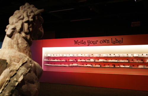
F&N: How has the public responded? When I visited the entire ‘make your own label’ wall was full!
The public response is amazing. I think we have really tapped into something with this approach.

All ages are writing.

It is clear from their own labels that they are reading all the information and thinking about it. It is as though we have put out the invitation in such a way that they want to respond.

Here is one of the (edited) labels about Object 17431–1, a ball of puree, purchased in 1887, from the children at Stanmore Public School. I think this also gave everyone confidence to write.

Elephant Wee

Elephant’s wee

This lovely little ball is a great treat for all to eat. Made out of pure elephant wee, it is a luxury and only served at the finest of places. It was discovered in Africa in an elephant café when an elephant peed in a glass and another elephant drank and said it was good! So the elephant chef figured out how to make it into a great treat!

It then made its way to humankind and I guess some one drank it and liked it and sold it to the museum where it is now. If you want to try it, eat it now at your closest elephant restaurant shop.

Augustine, aged 9
Stanmore Primary School

F&N: This reaction doesn’t seem to ‘just be kids’ – despite this being clearly identified as a ‘for kids’. Do you think that this sort of ‘fictional’ museum can scale? Could you have an entire museum created as an ‘experience’ in this way?

That’s a good question and I’m not quite sure at this stage.

I think putting something different in makes you relook at it all. By considering what’s odd you consider what is ‘normal’ if you like. It is the juxtaposition of approaches that is effective.

Possibly because it is in a ‘kids exhibition’ it gives permission and confidence for adults to write. Or perhaps Shaun’s own ethos about who he writes for is coming back as who is responding to it;

‘…anyone who is curious, who enjoys strangeness, mystery and oddity, who likes asking questions and using their imagination’

Thanks to Helen Whitty for the interview and Paula Bray for the photographs.

If you are in Sydney, pop in and see the Odditoreum and tell us what you think!

Categories
Mobile QR codes User experience

A quick QR code update

As regular readers know, we’ve been trialling QR codes and a little while back rolled them on a small selection of object labels in a Japanese fashion display.

I’ve been keep an eye on their usage and some of the continuing problems around lighting, shadows, and low-resolution mobile phone cameras like the current iPhone 3G. So far usage has been, as expected, low. Firstly, the target audience for the exhibition content has, not surprisingly, not been very tech-savvy. Secondly, the ‘carrot’ isn’t clear enough to cause the audience to respond to the call to action.

More critically, one thing we still haven’t quite gotten right is the image size and error correction.

Shortly after the last post we upped the error correction in the codes to 30% (meaning that up to about 30% of the image can be obscured and it still scans – although it is isn’t evenly spread). This alone wasn’t enough.

With the long URLs encoded in the codes plus the error correction the resulting QR codes were even more ‘dense’ and hard to scan with 2 megapixel cameras. We’ve now done another set of codes with our own version of TinyURLs that generate locally. This has reduced the encoded characters from nearly 70 to around 25 characters – thus a far less dense code.

Even so, 2 megapixel cameras have patchy results when obscured by lens flare or shadow so our current thinking is that in the future the codes may need to be as much as 50% bigger.

Categories
Tools User experience

Readability – reducing clutter with a bookmarklet

I’ve become a fan of a bookmarklet tool called Readability.

What it does is remove the clutter from a content-rich webpage and optimise it for ‘readability’ (which of course, itself can be customised). Now museums tend to be serial offenders on text-heaviness – we love long text and I’m not one to argue that we should shorten it.

So whilst everyone emulates the ‘Print Version’ stylesheets that newspaper websites have these rarely make content more readable on-screen – that’s not their point. What Readability does is leaves the ‘Print Version’ to the end-user’s discretion and re-renders the content in a form that is immediately more readable on-screen.

To check it out install the bookmarklet in your browser bar then visit a content rich page, click the bookmarklet and voila, a more readable version!

It works on most browsers and seems to do a good job on most websites.

Here’s what happens to our very own collection records.

Before

After

Categories
User experience Web 2.0

Star Wars: Where Science Meets Imagination opens and is immediately on the web

Tonight we had the official public opening of Star Wars: Where Science Meets Imagination.

Already images and videos of the exhibition and the launch, taken by members of the public (“the people formerly known as the audience”) are starting to appear online across the social web.

Here’s photos on Flickr and no doubt tomorrow there will be videos on YouTube uploaded by visitors. And over on the fan forums there’s already much chatter. The Facebook page should get a bunch of uploads shortly, and tweets and status updates across the social networks will begin to happen (of course in far lower volume than in the US).

Of course in times past these images and discussions would have been private but now they are public and discoverable. We’ll be keeping an eye on activity over the coming weeks, listening and learning. We’ll also be posting ‘official’ photos soon.

If you swing by the exhibition yourself then make sure you post and tag your photos and comments.